After a few tests, the principal investigator told me my VO2 – a measure of how well your body processes oxygen, and a dominating factor in how well you do in endurance sports.
So what’s a good number? Floyd Landis (winner of the 2006 Tour de France) tested at 90. So did Greg Lemond (1986, 1989, and 1990). Lance Armstrong only tested at about 82 – but in an incredibly odd twist of body chemistry (in other words, the guy is a genetic freak), his body basically doesn’t accumulate lactic acid.
I waited with baited breath. My result? He said “58”.
I groaned. He looked surprised at my reaction, and told me that 58 really wasn’t that bad (later tests had me in the low 60’s).
So I looked up what the average person is.
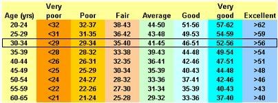 VO2
VO2Wait a second. I’m off the chart. Hmm. And the test normalizes by weight, which basically means that at race weight I’ll be in the high 60’s or maybe, if I train well, the low 70’s.
So then I looked at the next chart.
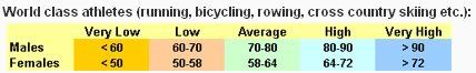 Professional Endurance Athletes
Hm. So right now I'm below average, and hopefully I can get to average by the end of summer. Not bad for before the altitude test, I thought.
So what about my power output? Before the test, it peaked at 396 watts.
 Allen and Coggan's Power Output Chart; widely discredited.
...which I was pretty happy with, too.
So then, after a week in the tent, these numbers went way up, right? Unfortunately, no. I caught a bit of a bug about halfway through the week, and only put out ~365 watts (while trying not to get nauseous) in the post-test. So the month's worth of testing was invalidated.
But I'm still happy.
3 comments:
I'm curious as to why you refer to the power profiling table as "widely discredited"? In point-of-fact, many coaches and/or sports scientists (including, e.g., some at the AIS) find it both accurate and highly useful, at least when used as intended.
First off, let me introduce the accomplished poster to the rest of our audience (none of the three people who read my blog are actually cyclists):
Author Andrew Coggan, Ph.D., (with apologies to Mr. Friel), is the power meter training bible; I own a copy and I've recommended it several times.
Calling it 'widely discredited' was really intended to be self-deprecating; there's no way I'm ~10% power/weight away from being a professional cyclist.
As a tool to determine the strengths and weaknesses of an individual cyclist, I think the chart is quite accurate. When you look at the chart, you note that I have terrible sprinting ability, and (unequivocally) perform better with longer events. Everyone who's ever seen me race, in either cycling or running, knows how true this is.
However, I think the absolute values aren't correct for the lower categories - the linear interpolation between pro levels and untrained levels makes it seem like Cat 4's and 5's are actually lower than they really are. Additionally, power to weight ratio is less important to cycling in Michigan than it is... pretty much anywhere else. There really aren't any hills here.
You can't come up with a chart for every situation, but in Michigan (ignoring high-acceleration efforts) you'd have a better chart if you normalized by rider cross section rather than weight. Granted X-section is perhaps more difficult to measure, my first guess would be to use shoulder breadth multiplied by height.
Maybe you should discredit Tara Reid instead. If she shows up on the blog it could lead to a much happier outcome...just an observation.
Post a Comment